Display Gallery Grid Block 3 Across on Mobile in Squarespace
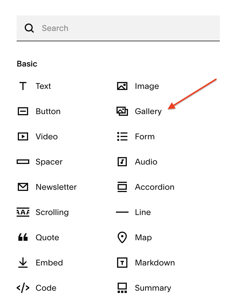
As of the time of this post, only Squarespace Circle members have access to the gallery block feature in Squarespace.
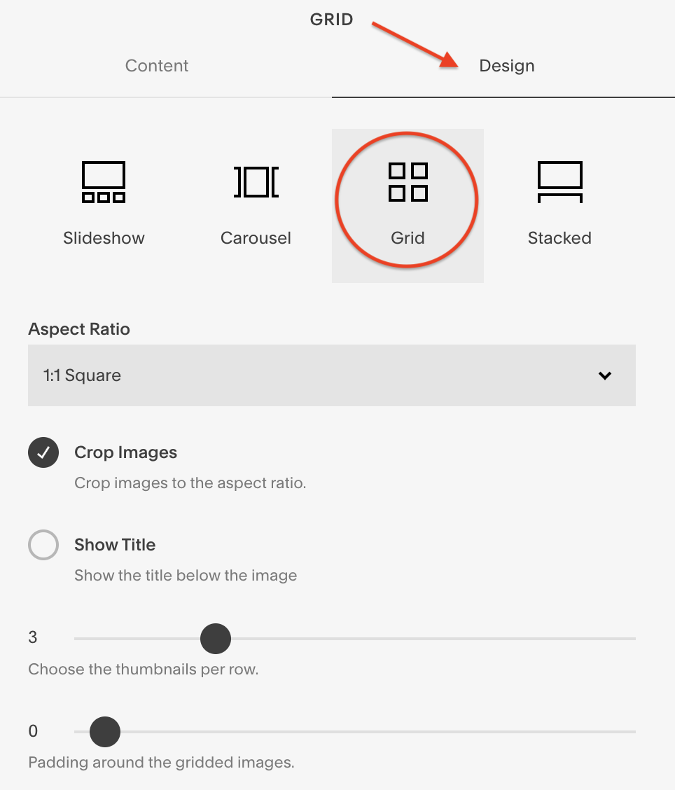
However, if a Squarespace Circle member has put a gallery block on your website then this applies to you too. And just to be clear, I'm referring to a gallery block using the grid layout.
Before you get all caught up in your website’s design, remember that your website is a lot more than just design. It's your website's job to attract and engage your target audience.
Be sure the check out website strategy blog posts before you leave so that the Squarespace website you’re working on right now will have a strategy to attract and engage its target audience.
BEFORE
AFTER
Display Gallery Grid Block 3 Across on Mobile in Squarespace
just to be clear, I'm referring to a gallery block using the grid layout.
Go to Website > Pages > Website tools > Custom CSS
Copy and paste the code snippet below (scroll down)
This code works on both Mobile and Tablet.
So easy, right?
Code Snippet to Display Gallery Grid Block 3 Across on Mobile and Tablet
/*Make gallery block display 3 across on mobile and tablet*/

@media screen and (max-width: 767px) {
  .sqs-gallery-block-grid .slide.sqs-gallery-design-grid-slide {
    width: calc(~"100%/3") !important;
  }
}
Was this helpful?
Has this been bugging you a while? Can you think of all the place’s you’re going to use this? Share your thoughts in the comments. 👇
This page contains affiliate links


