How to Ask for the Sale on Your Website with Confidence
It might feel awkward, but let’s be real: if your website doesn’t clearly show visitors how to do business with you, you’re leaving money on the table.
Your website is where people come to learn what you do and decide if you can help them. But if you don’t tell them what to do next, most people aren’t going to take the time to search the pages of your website to figure it out—they aren’t willing to invest that much time in you.
This post will show you exactly how to ask for the sale—clearly, directly, and without hesitation, so you can turn visitors into committed customers who feel confident taking the next step with you.
Be Bold, Not Bashful
Hesitating to ask for the sale creates hesitation in your audience too. If your CTA sounds timid or vague, people will question whether you believe in what you’re offering.
Use clear, direct language. Here are some strong CTA examples:
Book Now
Buy Now
Schedule a Call
Work With Me
Shop
Start Your Free Trial
Apply Now
These phrases are short, direct, and tied to a clear action. They let your audience know exactly what to do.
FAQ
Q1: What if I don’t want to sound salesy?
A1: Being clear and confident is not the same as being pushy. You’re simply guiding your visitor to the next logical step.
Q2: Can I still sound friendly and approachable?
A2: Absolutely. You can be warm and welcoming and direct. Tone comes through in your surrounding copy.
Avoid Weak Calls-to-Action on Your Website
You might think that using a passive CTA sounds more inviting or less pushy—but in reality, it makes you sound timid, which can convey a lack of confidence in your own products or services.
Weak calls to action don’t move people to act. They come off as more of a "do this homework before you actually buy"—an extra step your visitor doesn’t want to take when they’re already interested and just want to move forward.
Here are examples of weak CTAs:
Our Philosophy
About Us
Learn More
Curious?
Explore
See How
These phrases are vague, passive, or misleading. They might belong in your navigation (probably not)—but they shouldn’t be used as your main CTA.
FAQ
Q1: Is “Learn More” ever okay?
A1: Only if you genuinely want your visitor to do some research first—and even then, never as your main CTA. For example, it might be appropriate if you're linking to a detailed service page before they book a call.
Q2: What if I really want to link to my ‘About’ page?
A2: You probably only have an ‘About’ page because you see it on other websites and someone told you this was an important page to have on your website (not IMO). But most websites don’t need an About page—and removing it can actually increase the chance your visitor clicks on your main CTA instead of getting distracted. If you insist on having one, you can put it in your navigation or link to it within the context of the homepage.
Keep It Consistent
Pick a strong CTA and stick with it. Repetition creates recognition and trust. If you keep switching up your button text, you create friction and your visitor will get confused.
Use the same phrase everywhere it appears. Make your CTA buttons look the same across your entire site. This visual and verbal consistency reinforces the action you want them to take.
FAQ
Q1: Can I test different CTAs?
A1: Yes, but test them one at a time. Don’t confuse your visitors with competing messages.
Q2: What if I have a secondary CTA like 'Learn More'?
A2: Secondary CTAs like "Learn More" are fine as long as they support—not compete with—your primary CTA. Use them to link to detailed information, like a service page, but make sure your main action (like "Book Now") stays front and center. Your secondary CTA should also look different—don’t use the same color, shape, or size as your primary button. This helps visitors quickly distinguish the primary action you want them to take.
Where to Place Your Strong CTA on Your Website
Where you put your CTA matters just as much as what it says.
Your main call to action should appear:
In the upper right corner of your navigation (this is where the eye goes first—Z-pattern)
In your hero banner at the top of the homepage
At the end of every long page
Multiple times on long scroll pages (never more than a screen or two away)
Make it obvious. Don’t bury it and don’t make people search for it. Put it where they would expect it, just like you know where to find the cash register in a store.
FAQ
Q1: Why does the top-right corner matter so much?
A1: Eye tracking studies show people scan pages in a Z-pattern—starting at the top left, then top right. That corner is prime real estate.
Q2: How many times should I repeat the CTA on a page?
A2: As many times as necessary to make sure it’s always within reach—especially on long pages.
Make It Easy to Take the Next Step
If your website demonstrates all the ways you can help someone, you owe it to them to make the next step obvious. You are doing them a favor.
Don’t make people hunt for how to work with you. Don’t make them read a novel before they get to the good part. Make it easy.
FAQ
Q1: Is it possible to overdo it with CTAs?
A1: Not if you use them strategically. Repetition is only annoying when the copy isn’t working.
Q2: What if someone isn’t ready to buy yet?
A2: That’s what your blog and lead generators are for. Stay helpful and build trust.

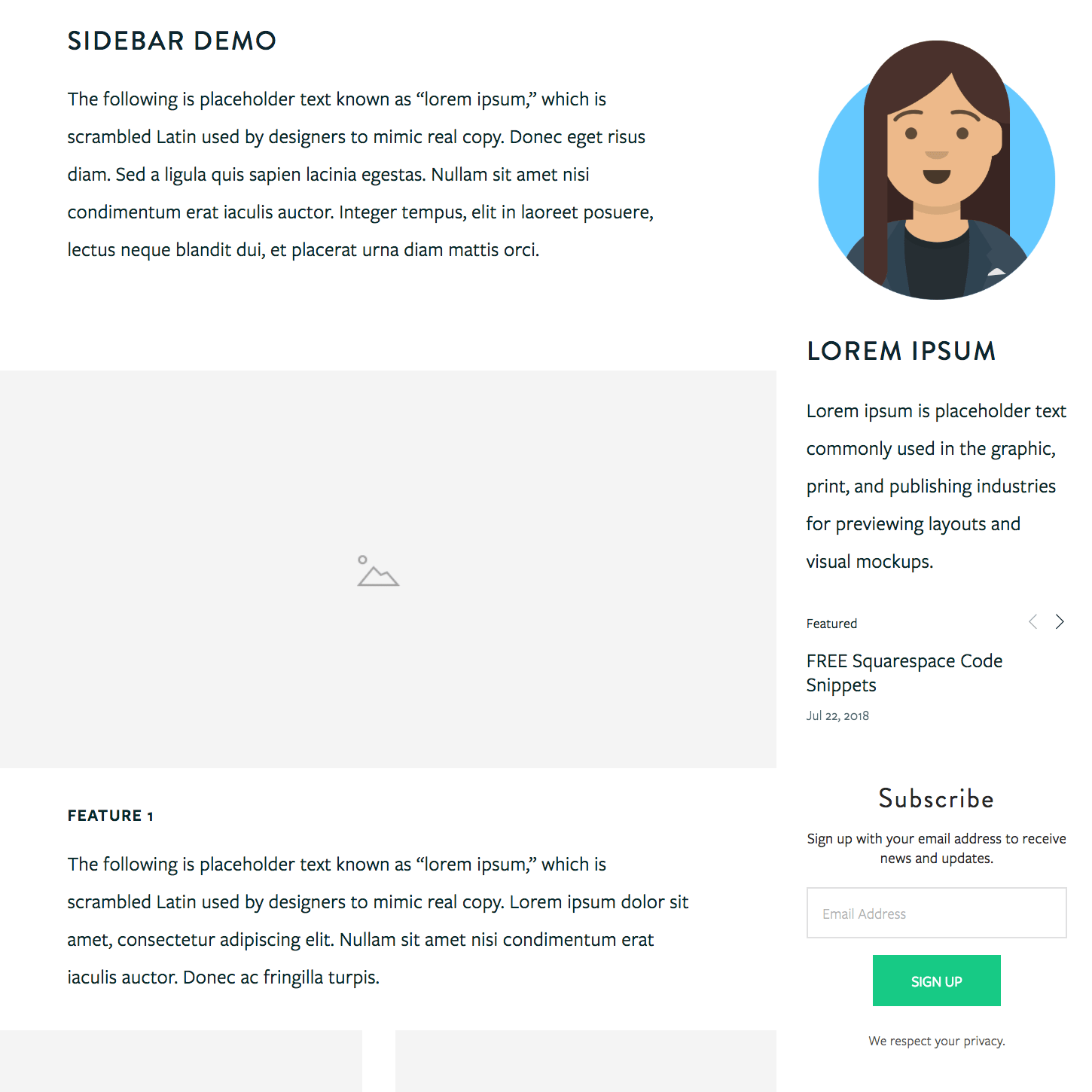
Check out the sidebar plugin by SQSP Themes—it’s my fave!
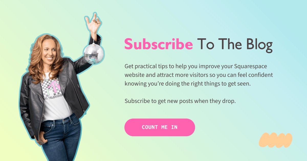
Why Your Blog Still Matters
97% of people who land on your site aren’t ready to buy. That doesn’t mean you shouldn’t have a strong CTA ready for them—it means you should also give them a reason to come back.
Helpful blog content that speaks directly to their needs is what will build the kind of trust that keeps you top of mind. So when they are ready to say yes, they’ll know exactly where to click.
FAQ
Q1: What kind of blog content keeps people coming back?
A1: Content that actually helps them solve a problem or understand something better—specifically the problem they’re trying to solve as it relates to your products or services. They have questions, and your content should provide helpful, trustworthy answers that guide them toward a solution.
Q2: Should I include CTAs in blog posts too?
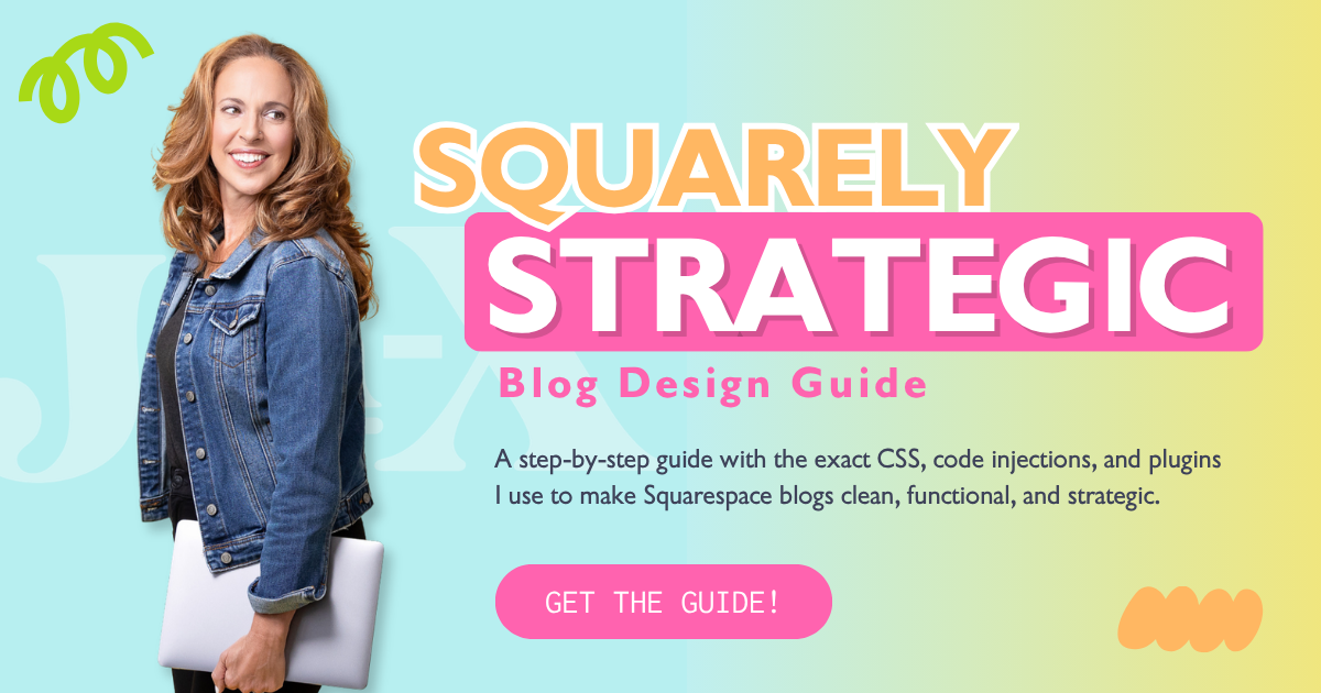
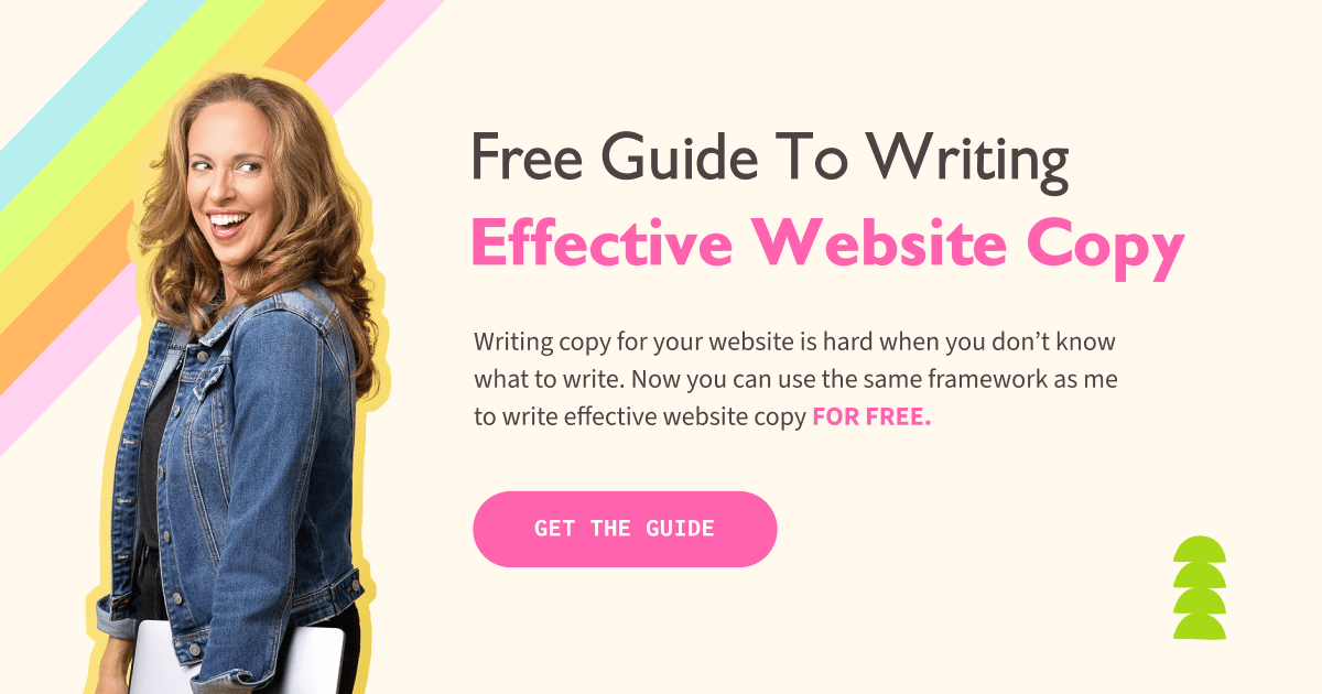
A2: IMO, blog posts aren’t the place to push sales—your main CTA belongs in the sidebar (this one is my fave) where it feels like a helpful suggestion, not a pitch. The CTAs that do belong in the body of your blog post are lead generators—free downloads or resources that genuinely help your audience take the next step while growing your email list simultaneously.
Key Takeaways
Use strong, direct CTAs like "Book Now" or "Schedule a Call"
Avoid vague or passive CTAs that create confusion or hesitation
Keep your CTA consistent in both design and language across your site
Place your CTA in strategic locations: top-right corner, hero banner, end of long pages, and throughout scroll-heavy content
Make the next step obvious and easy—don’t make your visitors search for it
Use your blog to build trust and provide value for visitors who aren’t ready to buy yet
Include lead generators in blog posts, not sales pitches
This page contains affiliate links