Why Your Website Isn’t Converting: It’s Not a Design Problem
At some point, almost every business owner thinks, "I need to redesign my website." More often than not, it’s because the site has never consistently generated strong inquiries in the first place, and the immediate assumption is that something must look outdated or unpolished.
For most businesses, though, “redesign” simply means rearranging visuals — new photos, updated fonts, a cleaner layout, maybe a different template.
Performance issues rarely begin at the design layer; they usually start higher up the chain, in the messaging and strategy guiding the entire site.
IN THIS POST YOU'LL LEARN:
Why unclear messaging quietly kills conversions
How buyer readiness should shape your website strategy
What structural mistakes weaken momentum
Why strategy must come before design if you want (better) leads

Weak Messaging Repels the Right Clients
Your website has seconds to communicate three things:
Who you serve
What problem you solve
What outcome you deliver
When those elements aren’t immediately clear in your header, visitors are left trying to figure out whether they’re in the right place, and if the header fails to capture attention, they won’t stay long enough to explore the rest of the page.
If you do capture their attention and they begin to scroll, the rest of the homepage has a new job: reinforce that initial clarity and guide them forward with intention.
Some of the biggest messaging mistakes I see on a website are:
Being too vague about who the offer is for
Over-explaining services instead of clarifying results
Avoiding the primary problem the client is actively trying to solve
Listing features instead of defining transformation
Trying to appeal to everyone at once
When that kind of messaging shows up on a homepage, visitors don’t move forward. They:
Skim without engaging
Click away within seconds
Open a competitor’s site to compare
Assume you’re similar to everyone else
Decide to "think about it" and never return
The problem isn’t effort, it’s clarity.
Clear messaging establishes relevance immediately. It demonstrates that you understand the client’s situation and have a defined solution. It signals competence before a portfolio is ever reviewed.
If your homepage doesn’t communicate a defined transformation, conversion will stall.
FAQ
Q1: How do I know if my messaging is too vague?
A1: If someone outside your industry can’t quickly explain what you do, who it’s for, and the result you provide, your messaging likely needs refinement. Clarity should be obvious within seconds.
Q2: Is messaging really more important than design?
A2: Messaging establishes relevance and trust. Design reinforces it. Without clear messaging, design may look impressive but won’t move the right people to act.

Most of Your Visitors Aren’t Ready to Buy
The majority of people who land on your website are not ready to hire you.
Industry research consistently shows that roughly 95–97% of buyers are not in an immediate purchasing window. Yet many websites are written as if every visitor arrived ready to schedule a call.
You should absolutely ask for the sale, and when a visitor becomes ready, your site should make the next step obvious and easy through clear calls to action, thoughtful placement, and consistent repetition.
But asking for the sale is only part of the equation.
A strategic website also nurtures the 95–97% who are still evaluating, researching, and comparing.
You do that by creating helpful, valuable content that builds trust over time. A well-written blog answers real questions. It names problems clearly. It demonstrates expertise without pressure.
This is where organic traffic becomes an asset. If you want to understand how blogging supports long-term visibility, watch my free class, The 3-Part Framework for Increasing Organic Traffic to Your Squarespace Website.

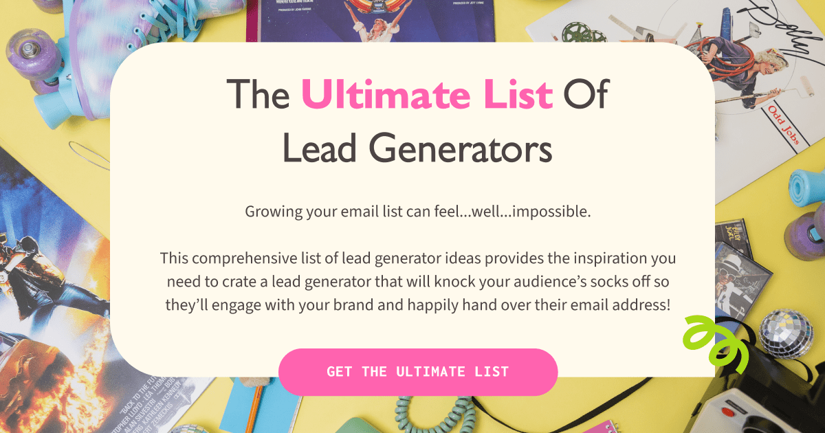
Build Your Email List Before They’re Ready to Buy
You also need ways to capture attention before someone is ready to commit.
Lead generators, guides, and free resources give visitors a low-commitment way to engage. In exchange for value, they join your email list — which allows you to continue nurturing the relationship long after they leave your website.
A website that only pushes "Book Now" misses the larger opportunity to build trust before asking for commitment.
A strategic website:
Clearly asks for the sale
Provides valuable educational content
Offers low-commitment entry points
Builds an email list intentionally
Nurtures trust over time
Engagement precedes conversion, and consistent nurture builds authority, which ultimately shortens the sales cycle.
FAQ
Q1: If most visitors aren’t ready to buy, what should my website focus on?
A1: Focus on clarity, authority, and trust-building. Help visitors understand their problem and see your expertise before asking for a high-commitment action.
Q2: Does this mean I shouldn’t include strong calls to action?
A2: You should include them — but pair them with lower-commitment options. Give visitors a way to engage at different stages rather than forcing a single decision point.
Structure Breaks Down When Everything Competes
Even strong messaging can underperform if the structure of your site works against it.
Structure degrades when we:
Firehose visitors with information they will never read
Present too many options immediately
Send traffic to pages that don’t lead anywhere meaningful
Treat every page as equally important
When a homepage tries to say everything, nothing stands out. Long, dense blocks of copy overwhelm instead of guide. Visitors skim, miss the point, and move on.
Choice overload creates a similar problem—decision fatigue. If your navigation offers ten equally weighted options, visitors don’t know what they’re supposed to do. They aren’t willing to invest time figuring it out. They won’t click around to decode your structure. They leave.
Another common structural mistake is directing people to pages that don’t support a conversion goal. A resource page that primarily sends visitors to other websites may feel generous, but it diverts attention away from your offers. You might be helping your visitor — but you’re not helping your business.
Strategic structure prioritizes momentum by guiding visitors clearly from one idea to the next.
Every primary page should:
Reinforce your core offer
Support a defined next step
Move the visitor closer to a decision
If a page doesn’t contribute to that movement, it deserves reconsideration.
FAQ
Q1: How much information is too much on a homepage?
A1: Enough to create clarity — not enough to create fatigue. If key points are buried in paragraphs most people won’t read, structure likely needs refinement.
Q2: Is it wrong to share external resources on my website?
A2: Not at all. But those resources should support your positioning and ultimately guide visitors back toward your offers. Generosity should still align with your business goals.
Strategy Must Precede Design
When messaging is defined first, design has a role.
Layout reinforces hierarchy. Visual emphasis highlights key decisions. White space creates focus. Calls to action appear exactly where momentum is strongest.
When design comes first, the site becomes a container waiting to be filled.
Design supports strategy; it does not replace it.
Businesses that experience consistent, aligned inquiries begin with positioning, messaging, and structure. Design follows with purpose.
If you want a guided way to clarify your messaging and build a thoughtful, values-aligned content strategy, my Heart-Centered Website Strategy Kit walks you step-by-step through defining your message, structuring your pages, and creating content that supports real connection and conversion.
FAQ
Q1: Should I redesign if my site isn’t converting?
A1: Audit your messaging first. Redesign without clarity often leads to the same results with a different layout.
Q2: How do I know if my problem is strategy or design?
A2: If visitors seem confused about what you offer or who it’s for, the issue is strategic. If clarity exists but usability is poor, design may need refinement.
Build Authority Before You Build a Layout
If your goal is higher-quality inquiries and stronger alignment, strategy must lead.
Clear messaging positions you as an authority. Intentional structure guides decision-making. Design then amplifies what is already clear.
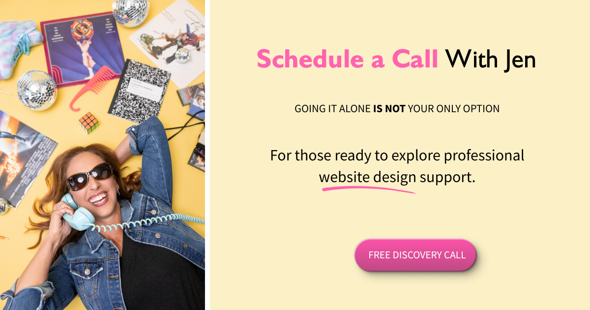
If you’re ready to approach your website as a strategic asset rather than a digital brochure, there are two ways to move forward:
Work with me to clarify your messaging and structure before redesigning
Start with one of my digital resources to evaluate your positioning and content independently
Authority is built through clarity, and conversion strengthens when structure supports it.
Your website should reflect both.
This page contains affiliate links